What is The Pantone Color Matching System (PMS)?
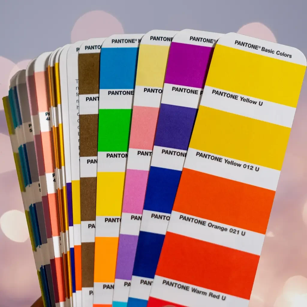
The Pantone Matching System (PMS) is a proprietary and standardized color system that unifies nearly 5,000 delicate color shades and variations. its detailed numbering system makes it easy for brands and manufacturers in different locations to standardize and match colors with precision, eliminating any inconsistencies in printed colors when using CMYK. It is a reliable and essential tool for any professional in the industry, ensuring a perfect color match every time.
Pantone is the universal language of color, empowering brands and manufacturers to make color-critical decisions at every stage of the workflow. With over 10 million designers and producers worldwide relying on Pantone products and services to help define, communicate, and control color with precision – from inspiration to realization – across a wide range of materials and finishes, including graphics, fashion, and product design.
When you think of the color “red”, maybe you think of a dark red, like crimson, or a bright red, like a stop sign?
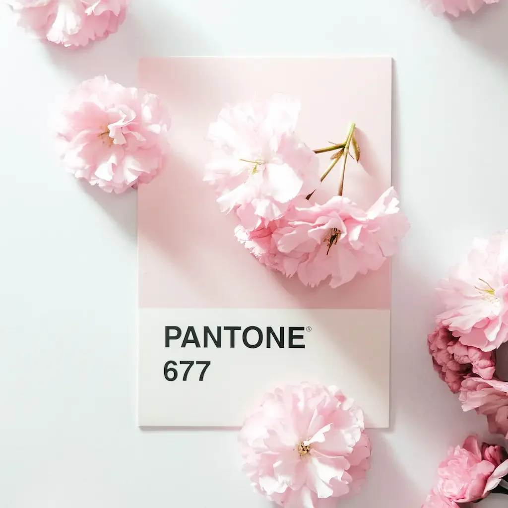
The color red can come in many different shades, from the dark and mysterious crimson to the bright and bold stop sign. In the printing world, the Pantone Matching System provides a universal standard for understanding and reproducing the many shades and variations of red, ensuring that the color is matched perfectly every time.
The History of The Pantone Matching System
Pantone, a commercial printing company established in the 1950s, was founded by two visionary brothers who were advertising executives. A few years after its establishment, they brought on board Lawrence Herbert, a recent college graduate with a background in chemistry. Herbert utilized his expertise to organize and categorize the company’s vast collection of printing inks and pigments, laying the foundation for the company’s continued success and revolutionizing the color and printing industry.
Imagine you have a tin project with a sticker, The paper sticker will be printed at one location by one printing company, and your custom tin packaging is being produced at a tin factory. How can you be sure that both the printing company and the tin manufacturer will use the exact shades and coloring in your sticker and tin packaging to create perfectly identical versions?
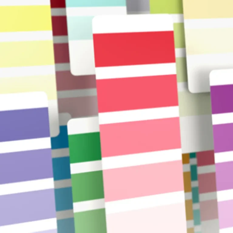
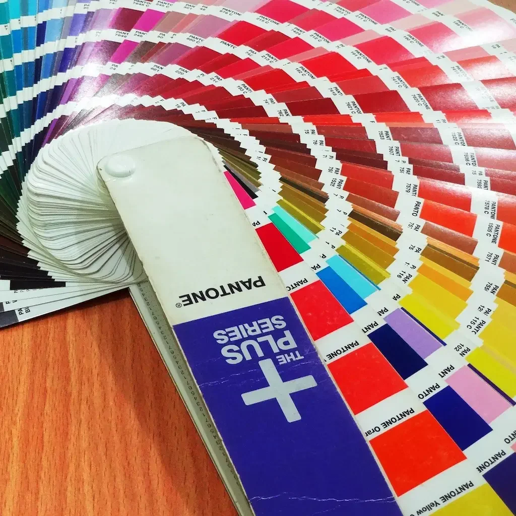
The Pantone Matching System (PMS) offers a comprehensive solution for color consistency. Pantone envisioned a system that would standardize color numbering and eliminate variations in printed colors caused by CMYK. The PMS features entire sheets dedicated to a single color, showcasing an array of subtle shades and variations. These sheets can be compiled into a “fan”, each coded by numbers, enabling print designers to standardize their printing process and match colors, regardless of printing machines or location.
The Two Pantone Matching Systems
Pantone actually has two different matching systems: one for packaging design, and one for product design.
Pantone offers an extensive selection of colors, with nearly 5,000 shades in total. The division of the color system into two different matching systems allows for the inclusion of what Pantone refers to as “market-relevant colors”. This allows for specific color choices that align with the demands and expectations of different industries, for example, product design may require a range of variations of blacks, whites, or neutral colors, while cosmetic packaging may demand colors that exude luxury, exclusivity, and visual appeal.
What’s more, the way a color looks will depend on the material that it’s printed on.
It’s important to note that the appearance of a color can also be affected by the type of surface it is printed on. Different materials can have a significant impact on the final result, resulting in variations in hue, saturation, and brightness. This is why it is essential for designers to take into account the specific properties of the materials they are working with, in order to achieve optimal color reproduction and overall visual impact.
Pantone Matching System (PMS) Palettes
PMS has a number of different color palettes including:
- Pantone Solid palette
- Process palette
- Textile palette
- Plastic palette
When selecting colors for your design, there are various palettes to choose from. So it’s important to take into consideration the material you’ll be printing on in order to ensure a harmonious and visually pleasing outcome.
The PMS system is an excellent choice for color matching as it offers many benefits, the most significant being its worldwide recognition and widespread use. By utilizing the PMS system, you can be confident that your printed material can be replicated with precision and consistency, regardless of where you go, as printers can match the colors to their corresponding Pantone codes.
The PMS system is renowned for its extensive color range and unparalleled accuracy and precision. Among the various color-matching systems available, none can compare to the Pantone system. In fact, the PMS system is so widely recognized and respected, that each year, a new color is selected to represent that year with vibrant names such as PANTONE 17-3938 Very Peri that evoke the sense of a unique and exciting flavor for your eyes.
Why are Pantone Colors Important for Packaging Manufacturers?
Pantone Colors are so important for packaging manufacturers for several reasons:
- Consistency: By using the Pantone Color System, tin box manufacturers can ensure that the colors of custom tins are consistent and look exactly like what the client wants. This is particularly important for creating consistent branding and artwork.
- Communication: The Pantone Color System provides a standardized language for color communication among tin manufacturers, clients, designers, and customers. This eliminates any confusion and ensures that everyone is on the same page when it comes to color requirements.
- Customization: The Pantone Color System allows tin manufacturers to create custom colors by mixing different color palettes. This is particularly useful for custom tin orders or made-to-order packaging.
- Quality control: By using the Pantone Color System, tin manufacturers can ensure that the colors of their packaging meet industry standards and customer expectations. This improves the overall quality of their packaging and enhances their brand reputation.
- Cost-effective: By using the Pantone Color System, tin manufacturers can reduce the costs associated with color matching and product rework, as well as improve their efficiency in production.
- Brand recognition: By using the same color codes for all packaging, tin manufacturers can create a cohesive and recognizable brand image tin packaging for the client’s company, which can help with brand recognition and increase customer loyalty.
- Competitive advantage: By using the Pantone Color System, tin packaging manufacturers can create high-quality, consistent tin products and help clients differentiate them from their competitors.
When to Use Pantone Colors?
When Consistency In Color Is Important
The Pantone Color System is particularly useful for ensuring consistency in color across different materials and printing locations. This makes it ideal for branding and packaging design where consistency is crucial.
When Printing a Large Solid Area of Complex or Difficult Colors
Some of the colors are very tricky to print using the CMYK system. For example, a blue color may print as purple on the press. To get rid of this tricky part in printing, just use the Pantone Matching System.
When Minimizing Expenses
Using the Pantone Color System can help to minimize expenses by reducing the number of inks needed to achieve a desired color. This can lead to cost savings in the long run without sacrificing the quality of the final product.
When Working With Multiple Suppliers or Manufacturers
The Pantone Color System is widely used and recognized in the industry, so it can be used to communicate color specifications and ensure consistency across different suppliers or manufacturers.
When Matching With Physical Samples
The Pantone Color System allows matching colors with physical samples as it’s available in both physical and digital form, which is useful when working with pre-existing materials or products.
What is The Difference Between PMS and CMYK?
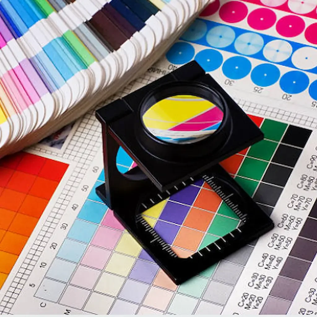
In order to understand the difference between PMS and CMYK, it’s important to first understand the difference between spot color and process color. PMS is a spot color system, meaning it uses specific, pre-mixed ink colors to achieve a specific hue. It’s perfect for reproducing a specific brand color, such as the iconic yellow of McDonald’s Golden Arches. As PMS colors are a great way to ensure that brand colors are consistent across all printed materials.
CMYK is a process color system, which uses a combination of four colors to create a wide range of hues. It’s ideal for reproducing photographs and other images with a wide range of colors.
CMYK colors are not guaranteed to be uniform between printers or even print jobs, whereas Pantone colors are, because they can be selected based on a certain and globally understood name or color code.
Can You Convert from Pantone to CMYK? Can You Convert from CMYK to Pantone?
Converting from Pantone to CMYK involves using a Pantone-to-CMYK conversion chart online tool or software to match the closest CMYK values for each Pantone color. However, it’s important to note that because the Pantone system is a spot color system and the CMYK system is a process color system, there may be some variations in color when converting.
Converting from CMYK to Pantone involves using a CMYK-to-Pantone conversion chart or software to match the closest Pantone color for each CMYK value. However, since the CMYK color space is wider than the Pantone, there may not be a perfect match.
It’s worth noting that It’s also important to keep in mind that the final output will depend on the printing process, paper, and ink used, so the conversion results may vary accordingly.
Have Questions About Working with the PMS?
The Pantone Matching System or PMS is a simple system, but its impact on the industry is significant. PMS allows for the highest quality color reproduction and precise color matching, ensuring consistency across various materials.
At Tinshine, we understand that there may be questions and concerns about working with the PMS, as well as converting between it and other color systems such as CMYK. Rest assured, as experts in tin packaging design utilizing both CMYK and PMS, we are here to guide you through every step of the process.
Our team of professional packaging designers, printers, and graphic artists is dedicated to creating and printing designs that exceed your expectations. Whether it’s a small print job or large-scale printing, we have the knowledge, experience, and expertise to bring your custom tins to life with beautiful and affordable packaging.
Don’t hesitate to reach out to us today to learn more about how we can utilize the PMS to bring your tin packaging to the next level.