When it comes to choosing the colors to paint your tin packaging, there are two options to consider: Pantone and CMYK. Each has its own unique features and benefits. Here’s our guide on how to get the best results for your tin packaging.
What is Color Space?
Color space is the backbone of design and printing, providing a clear and consistent system for describing and reproducing color. Color spaces define a precise and measurable range of colors and luminance values, ensuring everyone is on the same page to avoid printing errors. Color spaces serve as the foundation for accurate color reproduction in any medium and help bring consistency and harmony to the design and printing world.
What is CMYK Color?
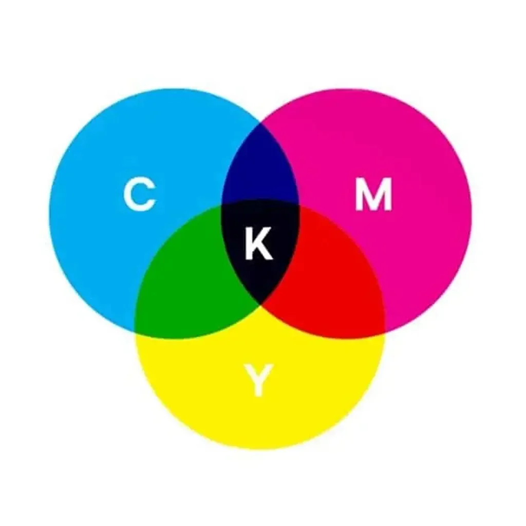
CMYK is a well-known and widely used printing model, known for its ability to create rich, dynamic, and highly detailed imagery. By blending together the four colors of Cyan, Magenta, Yellow, and Black (referred to as the “Key” color), CMYK creates an endless array of hues and shades, making it an ideal choice for producing professional-grade and vibrant imagery in various printed materials, including home office inkjet printers.
The magic of printing is truly remarkable, as it allows us to create stunning, lifelike imagery through the precise layering of tiny overlapping dots in a combination of four colors. The expertise of printers in understanding the exact percentages of each color needed to achieve a desired shade enables them to produce photorealistic and multi-colored imagery that is nothing short of breathtaking. CMYK is the preferred method for creating these masterpieces, making it the go-to choice for producing high-quality packaging designs and more.
The CMYK color model offers a vast array of color options for professionals and brands to choose from. Among the popular choices are the classic fan favorites such as Navy Blue CMYK, Rich Black CMYK, and Gold CMYK, known for their ability to consistently produce vibrant and brilliant printed results. Whether you’re looking for traditional accent colors or striking standout hues, CMYK has a color to suit every need.
What is Pantone Color?
Pantone is all about precision and consistency. By mixing inks in a specific way, Pantone allows for the creation of consistent, accurate color matches every single time. This system is globally recognized and widely accepted, which makes it the go-to choice for professionals and brands seeking to achieve the perfect color match across different mediums.
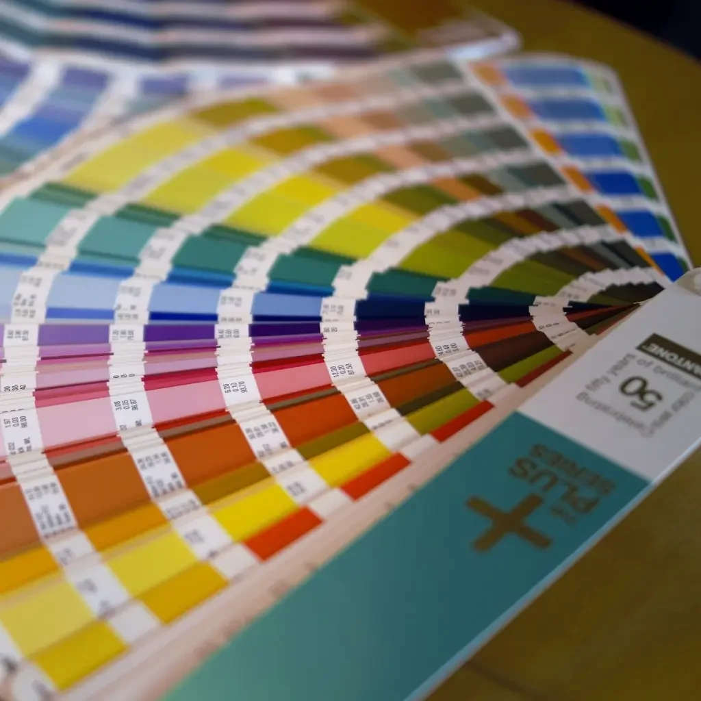
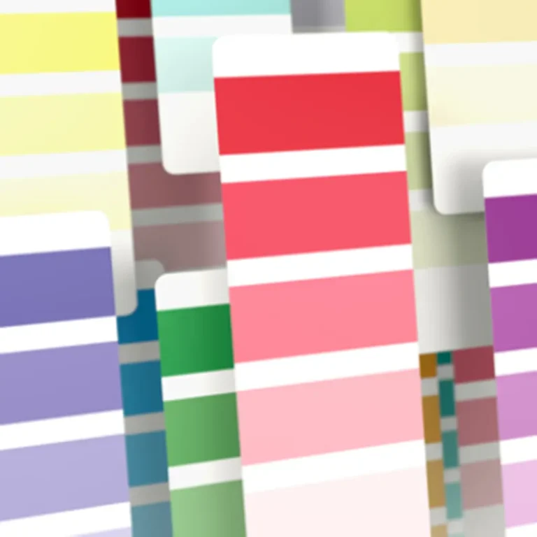
The Pantone Matching System (PMS) is a widely recognized and trusted system, known for its ability to achieve consistent and precise color matching. With over 1000 shades to choose from, it provides a vast array of options for professionals and brands. Each color is linked to a specific swatch sample and number, making it easy to select and replicate the desired shade. By standardizing colors in this way, tin manufacturers in different locations can ensure that their colors match perfectly, even if they cannot be compared visually. This results in an exact final match, printer to printer, project to project, ensuring that the desired results are always achieved.
Pantone offers a stunning array of rich, radiant hues such as Pantone Blue and Yellow, as well as unique, eye-catching finishes like metallic and neon. Its ability to consistently match colors makes it an ideal option for those seeking top-notch, consistent branding with a bold and colorful palette.
What’s the difference between Pantone and CMYK?
The key distinction between Pantone and CMYK printing is the precision of the final colors. The Pantone system guarantees an exact and consistent color every time, regardless of the printer or designer, while CMYK may result in slight variations in color.
The CMYK color model has certain limitations when compared to Pantone, as it may not always achieve the same depth and intensity of colors as Pantone. Additionally, slight variations in color may occur when printing from different devices and materials, even if they are using the same document. This can result in a 5-10% difference between the colors displayed on the screen and the final printed product.
Pantone offers the highest level of color accuracy and consistency, but it comes at a higher cost as it utilizes a more labor-intensive, single-print process. Instead of combining colors as in CMYK, Pantone uses a “spot color” technique, where each color is printed separately.
Pantone is an excellent choice for those looking for precise and consistent color reproduction. It utilizes a spot color method, where each individual color is printed separately, which allows for greater control and accuracy. However, this method also means that more colors require more spots, making it more costly. Pantone is a great option for simple branding designs, while CMYK offers more cost-effective solutions for projects that require a larger variety of colors.
But what happens when you need to print a real-life picture, where shadows create a lot more color variations on one surface? Spot coloring will be impractical for such a purpose.
This is where process colors come in. Process printing involves different ink sources that do not produce solid colors after one run. You cannot appreciate the final colors until the process is complete.
CMYK colors are process colors, as they offer a wide range of hues through the clever combination of cyan, magenta, yellow, and black inks. The “C” in CMYK stands for cyan, “M” for magenta, “Y” for yellow, and “K” for black which is also known as the key plate. This key plate serves as the foundation for the other inks, aligning them to create a cohesive and harmonious final image. The use of black, represented by “K”, is done to avoid confusion with blue, which is present in RGB colors.
Pantone colors have the following advantages when:
- You need a high level of color accuracy: The PMS system allows for precise color reproduction, making it ideal for branding and other applications where consistency is key.
- You need vibrant and true-to-life hues: As spot colors, Pantone colors ensure that hues are vibrant and true to life, making them great for applications such as architecture, cosmetics, and fashion.
- You need quality assurance: Pantone LLC requires ink manufacturers using the PMS to be Pantone-licensed and to submit base ink samples annually to ensure that they are within Pantone standards, thus ensuring that all PMS colorants around the world are standardized.
- You need a wide range of colors: The PMS uses 18 base inks, forming the 1,867 standard Pantone print colors currently in existence, including metallic, neon, and pastel colors. A wide range of custom colors can be made by combining the standard ones, making it best used for projects requiring hues beyond the CMYK range.
On the other hand, Pantone colors have the following disadvantages, too:
- Limited color range: The PMS system uses a limited range of base inks, which limits the overall color range that can be achieved. While the system offers a wide range of standard colors, it may not be able to match every color exactly.
- Higher cost: Using Pantone colors can be more expensive than using traditional CMYK printing methods, as it requires the use of specialized inks and equipment.
- Limited digital compatibility: Pantone colors may not be as easily translatable to digital mediums, as color reproduction can vary across different devices and platforms.
- Limited flexibility: Because the PMS system is based on spot colors, it may not be as suitable for certain types of printing or production methods, such as four-color process printing.
Meanwhile, the following are the CMYK system’s advantages:
- CMYK is cost-effective and efficient for creating real-life pictures and text. The printing process determines the final image colors.
- Better for printing: The CMYK model is more suited for printing as it is based on the colors used in the printing process (cyan, magenta, yellow, and black).
- Industry-standard: CMYK is the industry standard for printing, so most professional printing equipment and software use this model.
- There is no need to buy any standardization guidebooks, helping to further reduce costs.
However, these are the CMYK system’s disadvantages:
- It lacks international standardization. CMYK may not offer the same level of standardization as other color systems, resulting in variations in color reproduction between different manufacturers and equipment. This can be a risk for branding and consistency in color appearance.
- The process of using multiple inks in CMYK printing may not be practical for certain applications that require a single ink or paint application, such as fashion items, furniture, and infrastructure.
- The CMYK color system is limited in its ability to reproduce certain colors, and can only simulate 55% of the standard PMS colors. However, the addition of orange, green, and violet to CMYK using the CMYKOGV extended gamut, allows the simulation of 90% of standard PMS colors during process printing.
Here is a table comparing the two systems: Pantone color vs CMYK color
| Comparison | Pantone Color | CMYK Color |
| Use Spot Colors | Yes | No |
| Use Process Colors | No | Yes |
| Color standardization | Present | Absent |
| Ink color consistency licensing | Present | Absent |
| Accessibility to the average user | Not accessible | Accessible |
| Color range | Much broader | Broad |
| Recommended Uses | Branding Spot color applications Printing colors beyond the CMYK range | Real-life pictures Text Many designs per one order |
How to Convert CMYK To Pantone Colors?
Converting between color spaces can be a delicate task, especially when working with tin packaging. But, with the right tools and knowledge, it’s possible to seamlessly transition between CMYK and Pantone color systems, ensuring that your final product is an exact representation of your desired colors.
Converting between color spaces can be made easy with the right tools. This online tool is a CMYK to Pantone color converter. By inputting the desired CMYK or Pantone values, you can easily convert between the two color spaces. Furthermore, if your brand utilizes Adobe Illustrator or Photoshop, the conversion process can be done directly within the platform by simply switching the file’s color mode.
With a better understanding of the distinctions between CMYK and Pantone, your brand is well on its way to creating a beautiful custom tin packaging design. And if you’re curious about which Tinshine tin products are printed using which color space, we’re here to help. We offer a variety of custom tins printed in both CMYK and Pantone, and we’re happy to assist you in determining the best option for your desired design.
Tinshine’s Color Printing Range
At Tinshine, we utilize both Pantone and CMYK color systems in our tin boxes for food and confectionery, cosmetic, and luxury packaging. This allows our customers to benefit from a combination of precision, affordability, and a wide range of color options. Whether you are printing the same design across multiple packaging products, it’s important to be aware of which products use Pantone and which use CMYK for color consistency. With Tinshine, you can trust that your designs will be brilliantly printed using either Pantone or CMYK for optimal results. Here are the Tin products you can brilliantly print using Pantone or CMYK!
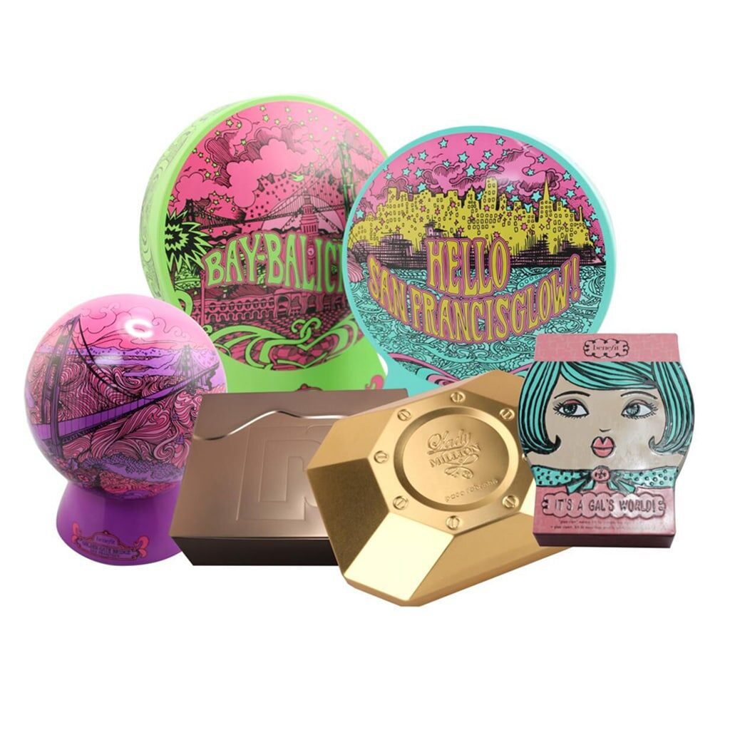
Pantone: Cosmetic packaging tins, Perfume packaging tins, and luxury wine packaging tins
At Tinshine, we understand the importance of precise color matching for branding. That’s why we use the Pantone Matching System for our cosmetic packaging tins, perfume packaging tins, and luxury wine packaging tins. This allows you to select the exact shade you want for your brand. We specialize in working with the Pantone Solid Coated and Uncoated libraries and occasionally utilize the Pastels and Neon Coated and Uncoated libraries.
For those who may not be familiar with the Pantone system, we offer an online Pantone color finder tool to help convert your brand’s colors into Pantone colors, ensuring an exact match. Additionally, our design platform includes a custom color picker that translates HEX color codes into a perfect Pantone match. Even in the unlikely event that color cannot be matched by Pantone, you will be presented with the closest alternative shades to choose from before we press print, ensuring that what you see on screen is exactly what you get.
At Tinshine, we are proud to offer our customers the added value of using silver as a bonus color on custom tins. As we use eco-friendly tinplate as our base material, we do not charge for the use of silver in your design, allowing you to incorporate this versatile color at no extra cost. This means that you can effectively achieve a three-color design for the price of two by utilizing the metallic silver color in your design.
We also want to highlight that for custom tin box products that are available to be printed in Pantone, the Pantone colors you choose must come from an uncoded library. If you desire to use more than two colors in your design, our team is more than happy to assist you – we can accommodate up to eight colors.
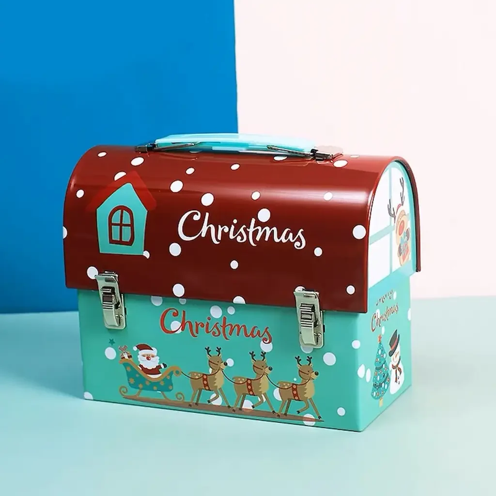
CMYK: Decorative tins wholesale, Christmas Tins, Cookie tins wholesale, Tea tins wholesale, Candle tins wholesale, Easter Egg tins
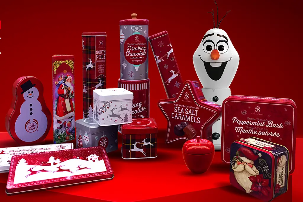
At Tinshine, we specialize in providing high-quality decorative tins wholesale for a variety of occasions, including Christmas, Easter, and other holidays. Our wide selection of tins includes cookie tins wholesale, tea tins wholesale, candle tins wholesale, and Easter Egg tins, all of which feature festive designs that are sure to delight. To ensure that our tins are of the highest quality, we print them using both the CMYK and Pantone color systems, ensuring that the final product is vibrant, accurate, and true to the original design. Whether you’re looking to stock up on tins for the holiday season or simply want to add some festive cheer to your home, we’ve got you covered.
Conclusion
We hope this has helped to clarify the differences between Pantone and CMYK printing, which are essential aspects of creating beautiful and vibrant tin packaging. Choosing the right printing method for your tin packaging is crucial in creating a visually striking and memorable product. With an understanding of the difference between Pantone and CMYK, you can ensure that the colors used accurately reflect your brand and bring a touch of joy to your customers’ daily lives.